FAST FACTS
• The original logo was never used on a jersey until January 1, 2011 when the team wore the logo on their Winter Classic jerseys. Before then, it was used on the official pucks and team stationery.
• The first jerseys used a simple diagonal “PITTSBURGH†lettering scheme that was favored by Coach Kelly, a former member of the New York Rangers, whose jerseys still feature drop-shadow, diagonal lettering.
• Gessner designed the University of Pittsburgh’s script “Pitt” logo first used on their football helmets in 1973. Gessner also drew the “friendly pirate” emblem used by the city’s baseball team from 1968 to 1986.
You can’t call them ‘the Penguins.’ That’s ridiculous. BOB GESSNER, The artist responsible for creating the franchise’s first logo, after he learned of the team’s nickname
On a Right Wing and a Prayer 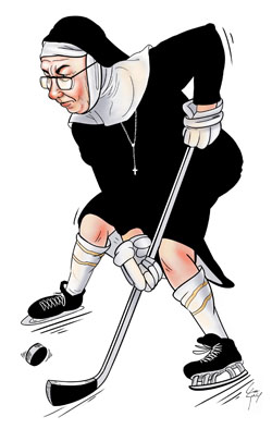 “They skated like a bunch of nuns!” It sounds as though it rolled off the tongue of Mike Lange, but it’s really the punchline to a joke uttered by the Pittsburgh Penguins’ first coach, Red Sullivan. Sullivan hated the proposed black and white colors and “Penguins” nickname for Pittsburgh’s NHL expansion team. According to Pittsburgh freelance artist Bob Gessner, the famous Sullivan quote went as follows: “The day after we play a bad game, the sportswriters will say, ‘They skated like a bunch of nuns.’ †The team was named February 10, 1967, after more than 26,000 entries from a newspaper contest were fielded. The Penguins would play home games at the Civic Arena, or “The Igloo,†and the nickname seemed like a natural choice to Carol McGregor, the wife of Penguins’ owner, Sen. Jack McGregor. Gessner had a disdain for the new team name, too. He favored the adoption of the Hornets nickname used by the Pittsburgh’s AHL team. “The Penguins? No, really, what will the team be called?†quizzed Gessner, upon first hearing the name. “You can’t call a hockey team ‘the Penguins.’ That’s ridiculous.’ â€
“They skated like a bunch of nuns!” It sounds as though it rolled off the tongue of Mike Lange, but it’s really the punchline to a joke uttered by the Pittsburgh Penguins’ first coach, Red Sullivan. Sullivan hated the proposed black and white colors and “Penguins” nickname for Pittsburgh’s NHL expansion team. According to Pittsburgh freelance artist Bob Gessner, the famous Sullivan quote went as follows: “The day after we play a bad game, the sportswriters will say, ‘They skated like a bunch of nuns.’ †The team was named February 10, 1967, after more than 26,000 entries from a newspaper contest were fielded. The Penguins would play home games at the Civic Arena, or “The Igloo,†and the nickname seemed like a natural choice to Carol McGregor, the wife of Penguins’ owner, Sen. Jack McGregor. Gessner had a disdain for the new team name, too. He favored the adoption of the Hornets nickname used by the Pittsburgh’s AHL team. “The Penguins? No, really, what will the team be called?†quizzed Gessner, upon first hearing the name. “You can’t call a hockey team ‘the Penguins.’ That’s ridiculous.’ † Gessner, LEFT, made those remarks while he was being interviewed for the job to create the first official team logo. Not exactly a great first impression. Gessner, then 34 years old, was not afraid to admit his partiality to the Hornets because they had a logo he knew and loved. No kidding, – Gessner had also designed the Hornets crest. After studying at the Art Institute of Pittsburgh, Duquesne University and the University of Pittsburgh, Gessner spent a stint in North Korea with the U.S. Army before returning to Pittsburgh to begin his freelance artist career. Gessner’s Other Icons
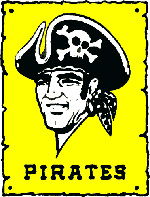
Pirates Baseball logo designed by Gessner in 1968
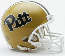
University of Pittsburgh logo designed by Gessner in 1973.
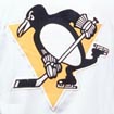
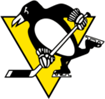
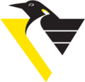
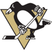
While earning his degree at Pitt, Gessner became friends with Beano Cook, Pitt’s sports information director. Cook gave Gessner some freelance illustration work for programs, newspapers and other Panthers’ publications. Gessner, now retired and living in St. Augustine, Fla., since 1996, was the creative brainchild behind the University of Pittsburgh’s script “Pitt” logo first used on their football helmets in 1973. Gessner also drew the “friendly pirate” emblem used by the city’s baseball team from 1968 to 1986. In addition to the Hornets’ logo makeover, Gessner did all of the artwork for the team’s programs. His reputation was solid in illustrating sports, and he impressed the Penguins’ first public relations director, Joe Gordon.Cook was friendly with Hornets’ public relations director, Bill Torey, who was searching for someone with Gessner’s skill. Torey wanted an artist to work on re-introducing the city to the Hornets since the team was inactive for five years while the Civic Arena was being built to replace the Duquesne Gardens, the Hornets’ home of 20 years. 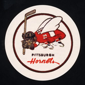 “I redefined the Hornets’ logo, made it tougher looking,†Gessner recalled. For the record, Gordon wasn’t fond of the Penguins’ nickname either and was a bit embarrassed when he had to introduce the team at the Pittsburgh Athletic Association. Gessner was paid $1,500 to design six potential versions of a logo that were presented to Penguins owners. “How can you make a penguin look mean?†bemoaned Gessner. “They are slow, small and awkward.†After a few weeks of brainstorming in his Mt. Washington studio, Gessner narrowed his focus to the mascot that is slightly different than what the team has on their sweaters today. The original Penguins’ logo only appeared on pucks and letterhead. The first logo featured a skating penguin with a scarf holding a hockey stick in front of a golden triangle emblematic of the city’s Golden Triangle. The team’s official colors changed at the last minute from black and white to black and gold, and that drew the ire of the Boston Bruins, who claimed thecolors were owned by the Bruins. “How the hell can you own a color?†Gessner protested at the time. “Red, white and blue were colors used by several teams. Why couldn’t we wear the same colors as the Bruins?” The new expansion Penguins team deferred to the established Boston club and agreed on a Columbia blue, navy blue and white color scheme. As an Ontario native, GM Jack Riley chose the colors of the Toronto Argonauts of the Canadian Football League and also of St. Michael’s College in Ontario. The original logo never made it on a jersey until 43 years later for the Winter Classic at Heinz Field. Before the Winter Classic it was used on the official pucks and team stationery for the first two seasons. The first jerseys used a simple diagonal “PITTSBURGH†lettering scheme that was favored by Coach Kelly, a former member of the New York Rangers, whose jerseys still feature drop-shadow, diagonal lettering. “The first penguin looked a little wimpy with the scarf, more like a figure skater than a hockey player,†admits Gessner.
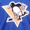
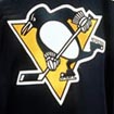
 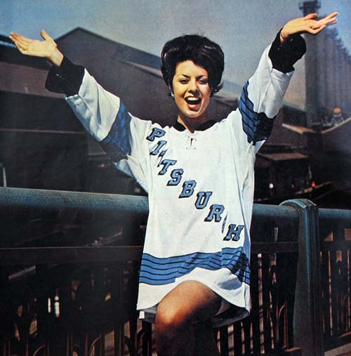 In May of 1967, Pittsburgh caught a glimpse of the hockey future when the United Fund’s Miss Torch, Karen Antkiewicz modeled the Penguins sweater for the first time. The scarf disappeared after one season, and the penguin changed a little over the first few years. You’d have to reference images of the original Mickey Mouse and Homer Simpson renderings to draw a similar comparison of the logo’s evolution. The 1968-69 Penguins opened the season with a new logo, marking the first time the familiar mascot was used on a jersey. The scarf was removed from the ‘67 logo. The penguin was made meaner looking with a broader shoulder and an eye that looked more determined. The lettering around the crest was reversed to a bolder font. The crest changed slightly again in 1970-71, being reduced to 7 1/4 inches. Also, the color blue changed slightly. In 1973, the logo’s triangle was moved off-center. The skating Penguin crest was basically the same design through 1992 when a radical change occured. Hanging up the Skates Gary Adams, an artist with Vance, Wright & Adams Design Group, came up with the “corporate-style” logo that was used on the shoulder patches until the start of the 2007-08 season. Adam’s said new Penguins’ owner Howard Baldwin wanted something more “marketable” and even considered changing the name back to the Hornets.” “Baldwin said: ‘They’re gonna kill me for changing the logo, why not the name?’ ” recalled Adams. “We even looked at replacing gold with the Vegas Gold color scheme.” The design was met with skepticism and superstition. Loyal fans thought the logo change was a Baldwin gimimick simply to generate money in jersey sales. Others, including Gessner, thought the logo change would ruin the Pens’ mojo. “They just won the Stanley Cup two years in a row and they wanted to change the logo?” recalled Gessner. “I was stunned and saddened. They were really on a roll and they decided to change horses.” In the first year of the “corporate-style” logo, the Penguins enjoyed their finest regular season, but were upset by the New York Islanders in the second round of the Stanley Cup playoffs – ending a bid for a third consecutive championship. The Penguins Logo through the years …Â
 |
 |
 |
 |
 |
 |
 |
 |
|||||||
| Â 1967-68 | Â 1968-72 | Â 1973-74 | Â 1975-78 | Â 1980-88 | Â 1990-92 | Â 1992-2001 |
2001 – now
|